The new Apple TV promises to revolutionise your television-viewing experience with apps, iTunes and Siri, but feels very much like a half-baked first-generation product, not a fourth-generation one.
The box
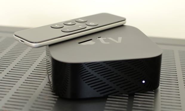
The new Apple TV is a small, glossy black box that sits under your TV. It’s not quite as small as the previous Apple TV, as it’s a third taller, but it’s about the same size as every other streaming-media box available.
Setup
Setting it up is quite straightforward. Plug in the power cable and hook it up to your TV using an HDMI cable. One isn’t supplied in the box, neither is an ethernet cable.
Sadly, even if you buy it from the Apple Store, the Apple TV does not come pre-configured with your Apple ID. Amazon does this with the Fire TV and Apple should too.
You have two options to set up the software. You can use an iPad or iPhone to setup the Wi-Fi and iTunes accounts, or manually enter your details with the remote.
Remote-based setup was straightforward, but entering text was tedious. Using an iPad the setup stalled the first time meaning I had to start all over again. But when it works it’s simply a quick tap of the tablet or smartphone on the top of the box then follow the instructions on the device. Five minutes and you’re done.
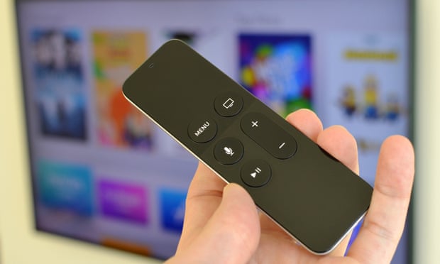
Once setup is done, you’re on your own. There’s no quick tutorial or help and there’s quite a lot hidden behind the scenes. For example, double tapping the “home” button, which is actually the one with a TV screen icon on it, takes you to a menu of recently used apps so you can swap between running apps. It’s unlikely to occur to you to try it; I did it by accident the first time.
Specifications
- Processor: dual-core A8
- Storage: 32 or 64GB
- Display: 1080p
- Sound: Dolby Digital 7.1
- Connections: 10/100 ethernet, HDMI 1.4, USB-C, Wi-Fi ac, Bluetooth 4.0
- Dimensions: 98 x 98 x 35mm
The remote
The Siri Remote is new. It has a touchpad at the top that acts as one giant button. The rest of the remote has menu, home and Siri buttons, volume control and a pause/play button.
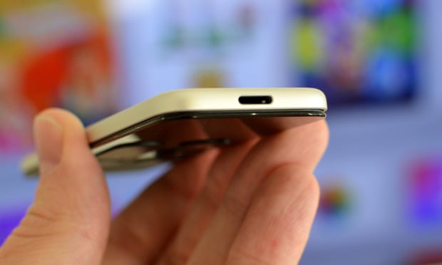
You charge it with a Lightning cable but a power adapter isn’t included. It cannot be charged from the Apple TV but there’s no light or anything on the remote to say when it is charging.
It connects to the Apple TV via Bluetooth and has an IR blaster for controlling the volume on your TV or amp, which should automatically just work, unless you have to manually programme it as I did with my Sony amp.
Swiping, swiping and more swiping
Swiping on the touchpad is less efficient than using a directional pad. Quick swipes scroll with a bit of momentum, you can tap one side or another to move one step left, right, up or down and press down to select. I kept wishing I could just press and hold a button for scrolling through long lists.
The interface has inertia built-in. Move your finger on the touchpad and a movie poster moves around slightly as if it the cursor is stuck on it before the selector zips off to the next movie along. It’s visually attractive but I found it didn’t make using it any easier – in fact, it actually inhibited quick selections.
Hold the Siri button to start up voice control. You can launch apps, ask simple questions – such as: “What’s the weather like?” – and search for movies and TV shows, but it doesn’t let you search for music or anything else.
The clever bit is the breakdown of search into different types. For instance, hitting the button and saying “Archer” brings up all seasons of Archer from the iTunes store and Netflix in the UK (more services in the US). It’s simple and works well.
More advanced searches such as “Pierce Brosnan movies” followed by “Only the good ones” shows the depths of the voice control. It works well.
Manually browsing content is a lot slower and less satisfying.
Apple plus third-parties
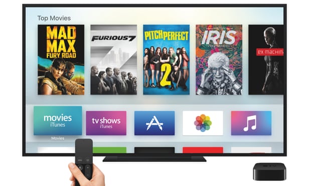
Content on the Apple TV is broadly divided into things provided by Apple and third-party stuff. In the Apple camp is access to the iTunes store for movies and TV shows, Apple Music or your iCloud Music library, iCloud Photos and the App Store.
It’s very clear when you start using Apple’s services that many of them are unfinished. Those that Apple has spent time and attention on – the movies and TV shows from the iTunes store – are very good. Siri works well, it’s slick and if you’re plugged into Apple’s ecosystem, it’s fantastic.
But the Apple TV’s music app is so basic it’s frustrating to use. It feels like something from 2006, scrolling through massive lists, swiping over and over with no way to quickly skip or search. Siri just says no thank you. I have a large music library within iTunes Match and it took me, literally, about five minutes to scroll from AC/DC to ZZ Top.
Once you’ve got to the right artist, album selection is fine, but skipping tracks is laborious. Select, scroll, select again. There’s no one button or gesture to get you to the next track. It’s made worse because you can play music in the background while doing other things. You can pause and play, but if you want to change the track you’ve got to dig all the way back into the music app.
Apps
The one big thing the Apple TV has going for it is the entrenched iOS developer community. Other boxes, such as Amazon’s Fire TV, have apps but no other has the draw that the Apple TV does for developers to create bespoke apps for it.
Apps range from YouTube and Now TV to Netflix – which integrates with Siri search – to shopping apps, weather apps, apps for working out and apps for hotel bookings. The BBC iPlayer isn’t available yet. There’s no ITV Player, All 4, Google Play or Amazon Prime Video.
The list of apps is only likely to expand, and while you might not end up wanting to shop on your TV, it’s just the tip of the iceberg if the iOS App Store is any indication.
Games
The Apple TV is about as powerful as an iPad Air 2 and so supports games with a similar level of graphical quality. Apple calls them “console quality”; some such as Galaxy on Fire, look good. Others are simply cutesy games.
Controlling them using the remote is either a Wii-like experience, swinging the remote around like a baseball bat for example, or a swiping and clicking affair. I found neither particularly satisfying, wanting dedicated, responsive buttons for arcade games and quickly growing tired of motion games.
You can connect third-party controllers to turn it into a makeshift console, but not every game supports it. The strange thing is you can connect up to three controllers and a remote, but not more than one remote, which makes Wii Tennis analogues out of the question. Two-player games such as Crossy Road, which allows you to use an iPad or iPhone as a second controller, were surprisingly good at a party.

Lorem ipsum dolor sit amet, consectetur adipisicing elit, sed do eiusmod tempor incididunt ut labore et dolore magna aliqua. Ut enim ad minim veniam, quis nostrud exercitation.


0 comments:
Post a Comment